import pandas as pd
import numpy as np
import seaborn as sns
import matplotlib.pyplot as plt

import os
path = os.path.expanduser('~/data/cbcpv/pokemon/')

df = pd.read_csv(path + 'pokemon.csv', index_col=0, encoding='cp1252')
探索数据
df.sample(5)
OUT:
| Name | Type 1 | Type 2 | Total | HP | Attack | Defense | Sp. Atk | Sp. Def | Speed | Stage | Legendary | |
|---|---|---|---|---|---|---|---|---|---|---|---|---|
| # | ||||||||||||
| 75 | Graveler | Rock | Ground | 390 | 55 | 95 | 115 | 45 | 45 | 35 | 2 | False |
| 82 | Magneton | Electric | Steel | 465 | 50 | 60 | 95 | 120 | 70 | 70 | 2 | False |
| 79 | Slowpoke | Water | Psychic | 315 | 90 | 65 | 65 | 40 | 40 | 15 | 1 | False |
| 123 | Scyther | Bug | Flying | 500 | 70 | 110 | 80 | 55 | 80 | 105 | 1 | False |
| 9 | Blastoise | Water | NaN | 530 | 79 | 83 | 100 | 85 | 105 | 78 | 3 | False |
对比并了解下数据集的各个特征类型:
df.info()

# OUT
<class 'pandas.core.frame.DataFrame'>
Int64Index: 151 entries, 1 to 151
Data columns (total 12 columns):
 #   Column     Non-Null Count  Dtype
---  ------     --------------  -----
 0   Name       151 non-null    object
 1   Type 1     151 non-null    object
 2   Type 2     67 non-null     object
 3   Total      151 non-null    int64
 4   HP         151 non-null    int64
 5   Attack     151 non-null    int64
 6   Defense    151 non-null    int64
 7   Sp. Atk    151 non-null    int64
 8   Sp. Def    151 non-null    int64
 9   Speed      151 non-null    int64
 10  Stage      151 non-null    int64
 11  Legendary  151 non-null    bool
dtypes: bool(1), int64(8), object(3)
memory usage: 14.3+ KB
可以看到Type 2这个特征有缺失值, 其他的没有, 而且显示的为正数型, 很符合数据分析的要求.
接下来用散点图研究特征Attack和 Defense的关系
sns.lmplot(
  x='Attack',
  y='Defense',
  data=df,
  fit_reg=False,
  hude='Stage'
)
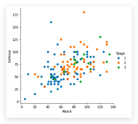
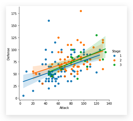
我们这里参数使用了fit_reg=False, 隐藏了回归线. 在 Seaborn 中是没有单独绘制散点图的方法的,但是通过参数设置,实现了散点图的绘制.如果此参数设置为True
接下来用箱线图看下各特征数据分布:
sns.boxplot(data=df)
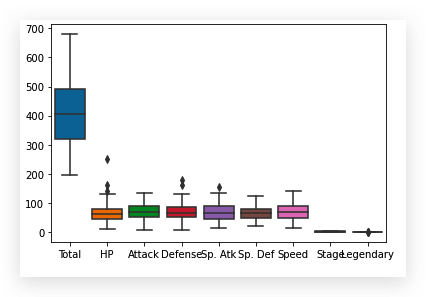
这个结果显示出, Total, Stage以及Legendary特征的数据是不适合在这里绘制散点图的, 需要对特征进行适当选择
stats_df=df.drop(['Total', 'Stage', 'Legendary'], axis=1)
sns.boxplot(data=stats_df)
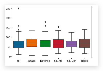
这样,比较清晰的看出几个特征的数据分布情况了, 非数字的特征自动摒弃.
在研究 Seaborn, 我们知道还有用 i 中研究数据分布的函数sns.violinplot, 我们尝试用它绘制特征Attack相对于特征Type 1的数据(这是一个分类行特征)的分布.
df['Type 1'].unique()

# OUT
array(['Grass', 'Fire', 'Water', 'Bug', 'Normal', 'Poison', 'Electric',
       'Ground', 'Fairy', 'Fighting', 'Psychic', 'Rock', 'Ghost', 'Ice',
       'Dragon'], dtype=object)
上面显示了特征Type 1中唯一数据, 即数据的值.
sns.set(
  style='whitegrid',
  rc={
    'rigure.figsize':(11.7, 8.27) # 设置了画布的尺寸
  }
)
pkmn_type_colors=[
  '#78C850',  # Grass
  '#F08030',  # Fire
  '#6890F0',  # Water
  '#A8B820',  # Bug
  '#A8A878',  # Normal
  '#A040A0',  # Poison
  '#F8D030',  # Electric
  '#E0C068',  # Ground
  '#EE99AC',  # Fairy
  '#C03028',  # Fighting
  '#F85888',  # Psychic
  '#B8A038',  # Rock
  '#705898',  # Ghost
  '#98D8D8',  # Ice
  '#7038F8',  # Dragon
]
sns.violinplot(
  x='Type 1',
  y='Attack',
  data=df,
  inner=None, # 去掉提琴图中的竖线
  palette=pkmn_type_colors
)
sns.swarmplot(
  x='Type 1',
  y='Attack',
  color='k', # 数据的点的颜色
  alpha=0.7
)
plt.title('Attack by Type')
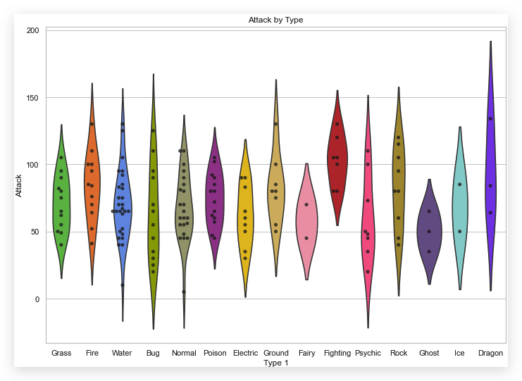
pkmn_type_colors是一个列表, 列出的颜色对应着特征Type 1中的唯一值.
因为去掉了提琴图内部的竖线,所以整个图没有太乱, 想知道有竖线的是什么样子, 可以注释掉inner=None这个参数.
之前我们删除了三个特征得到了一个变量stats_df引用的数据集:
stats_df.sample()
OUT:
| Name | Type 1 | Type 2 | HP | Attack | Defense | Sp. Atk | Sp. Def | Speed | |
|---|---|---|---|---|---|---|---|---|---|
| # | |||||||||
| 128 | Tauros | Normal | NaN | 75 | 100 | 95 | 40 | 70 | 110 |
数据结果中看出来, 特征HP Attack Defense Sp.Atk Sp.Def Speed都是整数, 在df.info()中也能看出来.现在有需求, 如果把这些特征分布进行可视化, 而且要放到一个坐标系中进行比较?
参考:
先使用pd.melt函数, 将所指定的特征进行归并
melted_Df=pd.melt(
  stats_df,
  id_vars=['Name', 'Type 1', 'Type 2'], # 保留的特征
  var_name='Stat' # 其余特征规定到这一列内
)
melted_df.sample(10)
OUT:
| Name | Type 1 | Type 2 | Stat | value | |
|---|---|---|---|---|---|
| 291 | Kabutops | Rock | Water | Attack | 115 |
| 406 | Marowak | Ground | NaN | Defense | 110 |
| 821 | Machoke | Fighting | NaN | Speed | 45 |
| 129 | Gyarados | Water | Flying | HP | 95 |
| 281 | Lapras | Water | Ice | Attack | 85 |
| 586 | Vaporeon | Water | NaN | Sp. Atk | 110 |
| 483 | Nidoqueen | Poison | Ground | Sp. Atk | 75 |
| 93 | Gengar | Ghost | Poison | HP | 60 |
| 791 | Vulpix | Fire | NaN | Speed | 65 |
| 481 | Nidoran‰ªÛ | Poison | NaN | Sp. Atk | 40 |
这样,在melted_df数据集中的Stat特征中的数据就是分类数据, 值是stats_df中被归并的特征名称.
melted_df['Stat'].unique()

# OUT
array(['HP', 'Attack', 'Defense', 'Sp. Atk', 'Sp. Def', 'Speed'],
      dtype=object)
在此基础上, 我们绘制反应分类特征数据分布的图示.
sns,swarmplot(
  x='Stat',
  y='value',
  data=melted_df
)
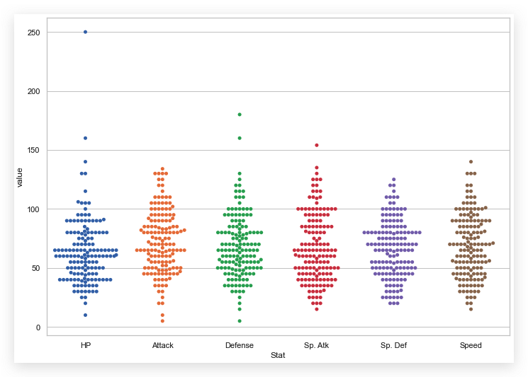
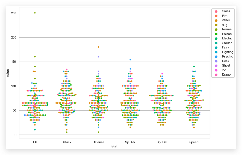
还可以在此基础上,再叠加一层分类:
sns.swarmplot(
  x='Stat',
  y='value',
  data=melted_df,
  hue='Type 1' # 叠加一层分类
)
plt.legend(bbox_to_anchor=(1, 1), loc=2)